Do you love the color blue? There are so many variations of blue that you’re bound to find one that can be incorporated into your home decor. Blue can be painted on the walls, you can bring in blue fabrics, and (one of my favorites) it can used to give new life to a piece of furniture. This week, let’s talk about this Polo Blue desk makeover and the process of choosing the right blue.

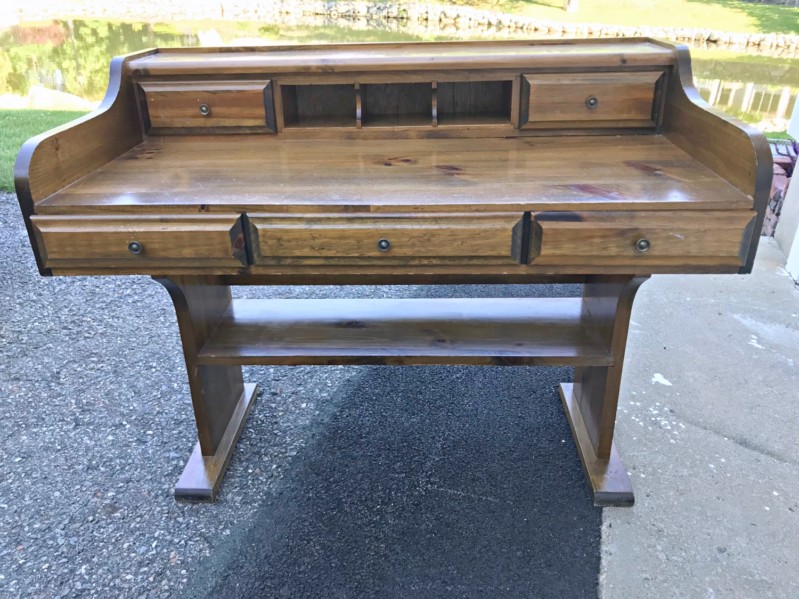
This colonial-stained desk was a curb-side find. My brother spotted it on his daily walk and called me twice over 12 hours to tell me I should go check it out. Lucky for me it was still there.
The owners put it out on the curb along with their other trash. On the one hand I can see why. The color was really outdated. But on the other hand the style was so unique! I’ve never come across a desk like this. It’s sort of a roll-top desk style, without the rolltop.

I knew right away I could refinish this desk to look completely different. The mere fact that all the lines were fairly straight (no colonial scrolls), meant I could bring it into an entirely new era.
Before we begin though, here’s a list of supplies used for this project:
- Craftsman rotary sander
- 8-hole sanding discs
- P100 Mask
- Zinsser BIN primer and inexpensive synthetic brush
- DTM water-based low lustre enamel paint, quart
- Purdy super-trim, angled 1-1/2-inch paint brush
- General Finishes Pitch Black glaze
- Minwax Polycrylic satin
- cotton rags (t-shirts cut into small squares)

My first thought was that I wanted to lighten the color. Going lighter meant sealing any stain that wasn’t initially sanded off and also sealing the pine knots so they didn’t bleed through later on.
Two coats of Zinnser BIN primer (a shellac-based primer) were brushed on. Brushing on BIN is messy and smelly so be sure to wear a P-100 mask in a well-ventilated workspace. THIS is the mask I wear when painting with BIN primer.

Next, I had to choose a color. If you’ve been here for a while, you all know I love blues and greens. I opted for blue and began searching for a medium blue that would appeal to both women and men. Here were a few of the options:


I’ve used Woodlawn Blue on dressers before (you can see one HERE) and loved it. Woodlawn is just a shade or two off of white and fairly neutral. A very easy blue to live with. Thinking I’d try something a little different and a little darker, I decided to try Languid Blue.

I love the color but sadly Languid blue was just not right for this particular desk. As soon as I stepped back and looked at the painted desk, I immediately felt that the color wasn’t right.
My husband said right off the bat that is was a colonial piece of furniture and he thought I needed to stick with a dark Federal blue or green color to work with the style rather than against it. He was right. So I mixed up a much darker blue from a few different ones I had in stock (Languid + Abyss + Evening Dove).
Abyss and Evening Dove (by Benjamin Moore) are both very dark blues. They have a lot of gray and less royal to them. But again, it still wasn’t quite the right blue. The custom mix was too gray-blue resulting in lack of color.

I originally wanted to change the style of the desk with a new, modern color. But the desk kept resisting. [Believe it or not, this happens a lot with furniture I refinish.] Again, my husband agreed that it must go darker to keep with the style of the desk. So I looked at these darker colors:


I really love all of these dark and have used almost all of them several times. The one I chose for this desk was Polo Blue.
I’ve used Polo Blue before on THIS dresser and THIS dresser. It was a nice safe, deep, rich navy blue. When I originally painted on the DTM paint in Polo Blue it looked exactly like the custom blue mix used earlier, but trust me, this paint darkens significantly as it dries. You can see how in this short video. Most of the desk top is dried Abyss blue. The darkest areas are the dried Polo Blue. See how much lighter the Polo Blue is when it’s wet and first brushed on.
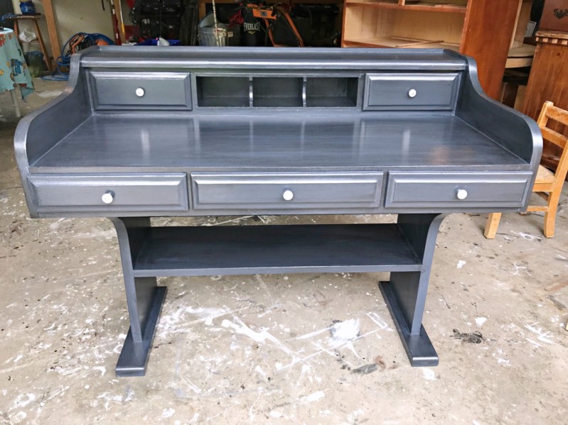
As soon as the Polo Blue was completely dry, I knew it was the right color for this desk. And I could have left it as that. But me being me, I like a little more depth to my furniture. So I wiped on a very light coat of General Finishes black glaze over the blue.
Doing this last step takes the furniture from a standard piece that you’ll see just about anywhere, to a one-of-a-kind, high-end stunning piece of furniture. You can see the shades of blue and black here…

and here…

The drawers offer some nice storage and the lower shelf so super efficient it makes you not miss the deep file drawers of a typical desk. And those cubbies are just the cutest mail slots.


When choosing a color for a piece of furniture, listen to your gut instinct but also listen to the furniture. Do not sway too far from the style the furniture wants to be. And if you don’t like your original choice, re-paint it!
Disclosure: This post may contain affiliate links to products I use myself.


Beautiful! I found the same style desk at our local dump and painted it in a creamy white, lightly distressed finish for my daughter. It came out very nice. I can’t remember, but I think it was an Ethan Allen piece?
Ethan Allen really! I searched for identification marks but didn’t find any. I’ll have to look again. I’d love to see this desk in the distressed white. If you have a link, please post it here.